| Author |
|
Eric Sofer
Byrne Robotics Member
Joined: 31 January 2014
Location: United States
Posts: 4789
|
| Posted: 24 September 2017 at 9:53am | IP Logged | 1
|
post reply
|
|
And another little nugget of dung... I can use my word processor to create a logo that looks like "Spider-Men II". But a true artist created "The Amazing Spider-Man" logo.
Perhaps the worst aspect is what that second cover makes me think... it looks to be the worst aspects of an older "action" cover mashed up with a pin-up cover. I'm not sure that it would attract me to buy that book in the least.
|
| Back to Top |
profile
| search
|
| |
John Byrne
Grumpy Old Guy
Joined: 11 May 2005
Posts: 133457
|
| Posted: 24 September 2017 at 10:47am | IP Logged | 2
|
post reply
|
|
Holy crap! It DOES say "Spider-Men"!Back when I filled in inking on a Hulk annual, the tale, by Roger Stern, featured a flock of replications of the Hulk. Roger's cover copy was "Holocaust is a Hundred Hulks!" Marvel's lawyers pounced, saying we could not use a plural form of "Hulk" on the cover, as it diminished Marvel's claim to the Hulk as a unique entity.
|
| Back to Top |
profile
| search
|
| |
Andy Mokler
Byrne Robotics Member
Joined: 20 January 2006
Location: United States
Posts: 2799
|
| Posted: 24 September 2017 at 11:05am | IP Logged | 3
|
post reply
|
|
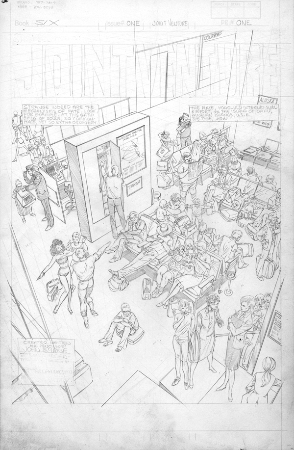
I'm reminded of a possibly apocryphal story. When Jack Kirby returned to DC, Carmine Infantino supposedly showed him a cover done by one of their best artists. It was a group of heroes standing at attention, facing the reader. Beautifully drawn, as only that artist could do it. Supposedly, Kirby took one look and said "But shouldn't they be DOING something?" ------------------------------------------------------------ --------------------------------- Not a cover, but on FB this page was posted and the general message was about all the work it was going to take. I couldn't help but wonder why? I mean, I suppose there could be a good reason to take a full splash page to show a bunch of people standing around(in a super hero comic book) but I'm skeptical that the story is really relying on it, much less benefiting from it.
Seems to me, if one is going to go to that much trouble, it should be action-packed or at least interesting. Lot of lines, but storytelling?
|
| Back to Top |
profile
| search
e-mail
|
| |
John Byrne
Grumpy Old Guy
Joined: 11 May 2005
Posts: 133457
|
| Posted: 24 September 2017 at 11:35am | IP Logged | 4
|
post reply
|
|
Hm.
|
| Back to Top |
profile
| search
|
| |
Wallace Sellars
Byrne Robotics Member
Joined: 01 May 2004
Location: United States
Posts: 17700
|
| Posted: 24 September 2017 at 12:26pm | IP Logged | 5
|
post reply
|
|
Andy, are you saying there's a problem with the page you posted?
|
| Back to Top |
profile
| search
| www
|
| |
Mike Norris
Byrne Robotics Member
Joined: 16 April 2004
Location: United States
Posts: 4274
|
| Posted: 24 September 2017 at 12:57pm | IP Logged | 6
|
post reply
|
|
Damn JB, it's like every person on that page has a story!!!!
|
| Back to Top |
profile
| search
e-mail
|
| |
Andy Mokler
Byrne Robotics Member
Joined: 20 January 2006
Location: United States
Posts: 2799
|
| Posted: 24 September 2017 at 5:51pm | IP Logged | 7
|
post reply
|
|
Andy, are you saying there's a problem with the page you posted?
For my money, a splash/full page in a super hero comic wouldn't consist of a bunch of people standing around. Nothing wrong with the drawing itself.
|
| Back to Top |
profile
| search
e-mail
|
| |
Charles Valderrama
Byrne Robotics Member
Joined: 16 April 2004
Location: United States
Posts: 4847
|
| Posted: 24 September 2017 at 5:56pm | IP Logged | 8
|
post reply
|
|
THAT page above should put to rest that JB's "older stuff is better" garbage!!!!
Anyhoo....
And another little nugget of dung... I can use my word processor to create a logo that looks like "Spider-Men II". But a true artist created "The Amazing Spider-Man" logo.
********
Exactly, Eric - yet another lost art in the age of computers!
-C!
|
| Back to Top |
profile
| search
| www
|
| |
Matthew Wilkie
Byrne Robotics Member
Joined: 09 March 2011
Location: United Kingdom
Posts: 1139
|
| Posted: 25 September 2017 at 12:59pm | IP Logged | 9
|
post reply
|
|
On the second cover: the reflected image of the two (? ugh) Spider-men should show them leaping at the villain rather than apparently standing at the bus stop.
***
That line continues to make me chuckle, Lars. They look exactly like they are standing at the bus stop.
And I know others, including JB are not fans, but I miss the Marvel corner box.
|
| Back to Top |
profile
| search
|
| |
Brian Rhodes
Byrne Robotics Member
Joined: 19 April 2004
Location: United States
Posts: 3338
|
| Posted: 25 September 2017 at 2:22pm | IP Logged | 10
|
post reply
|
|
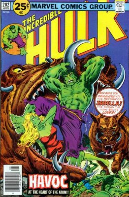
If it weren't for awesome covers, I probably wouldn't have met this big guy until much later:

|
| Back to Top |
profile
| search
e-mail
|
| |
Bill Collins
Byrne Robotics Member
Joined: 26 May 2005
Location: England
Posts: 11307
|
| Posted: 25 September 2017 at 2:40pm | IP Logged | 11
|
post reply
|
|
Maybe that's the end of issue cliffhanger...was the bus
late? Did it arrive at all? Be here in 30 days true
believers!
|
| Back to Top |
profile
| search
e-mail
|
| |
Charles Valderrama
Byrne Robotics Member
Joined: 16 April 2004
Location: United States
Posts: 4847
|
| Posted: 25 September 2017 at 2:54pm | IP Logged | 12
|
post reply
|
|
Uhhh, JB's splash is clearly what is called an "establishing shot". (Sets up the story.) Being that it's JB, I'm pretty sure the comic book would be worth the money!
-C!
|
| Back to Top |
profile
| search
| www
|
| |