| Author |
|
Greg Kirkman
Byrne Robotics Member
Joined: 12 May 2006
Location: United States
Posts: 15772
|
| Posted: 18 December 2018 at 9:48am | IP Logged | 1
|
post reply
|
|
IRON MAN 197 is one of my favorite Marvel covers from any era. •• Then I will say nothing... ++++++++++
I’ll say something. It’s memorable because it’s such a simple image of the main character in action! Less is more, sometimes!
|
| Back to Top |
profile
| search
e-mail
|
| |
Jeffrey Rice
Byrne Robotics Member
Joined: 10 September 2011
Location: United States
Posts: 1162
|
| Posted: 18 December 2018 at 6:09pm | IP Logged | 2
|
post reply
|
|
IRON MAN 197 is one of my favorite Marvel covers from any era. •• Then I will say nothing... ++++++++++ JB, are those your pencils under there?
|
| Back to Top |
profile
| search
|
| |
Doug Centers
Byrne Robotics Member
Joined: 17 February 2014
Location: United States
Posts: 5804
|
| Posted: 18 December 2018 at 7:28pm | IP Logged | 3
|
post reply
|
|
I would love to see the inked version of this beautiful cover, sans lettering.
|
| Back to Top |
profile
| search
|
| |
Shane Matlock
Byrne Robotics Member
Joined: 12 August 2012
Location: United States
Posts: 1759
|
| Posted: 19 December 2018 at 12:17am | IP Logged | 4
|
post reply
|
|
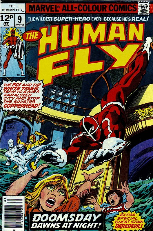
Those Marvel Comics Presents covers are so freaking great. Never seen them before.
|
| Back to Top |
profile
| search
|
| |
Jason K Fulton
Byrne Robotics Member
Joined: 23 September 2016
Location: United States
Posts: 843
|
| Posted: 19 December 2018 at 8:14am | IP Logged | 5
|
post reply
|
|
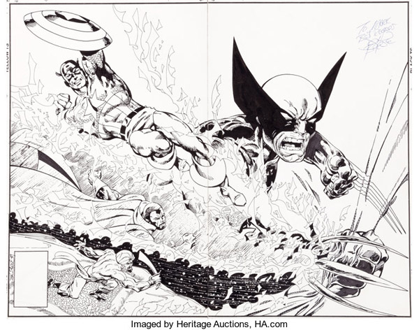
Here's the original for that particular MCP - it was sold at Heritage for a little less than $9k a few months ago:
The link has a giant version of the art:
https://comics.ha.com/itm/original-comic-art/john-byrne-marv el-comics-presents-47-wrap-around-cover-wolverine-and-captai n-america-original-art-marvel-1990-/a/7152-92056.s?ic4=Galle ryView-Thumbnail-071515
|
| Back to Top |
profile
| search
|
| |
Brian Miller
Byrne Robotics Member
Joined: 28 July 2004
Location: United States
Posts: 32145
|
| Posted: 19 December 2018 at 11:05am | IP Logged | 6
|
post reply
|
|
That looks much better. The coloring doesn’t do it justice. Too dark and muddy to make it “pop”.
Edited by Brian Miller on 19 December 2018 at 11:05am
|
| Back to Top |
profile
| search
|
| |
John Byrne
Grumpy Old Guy
Joined: 11 May 2005
Posts: 136702
|
| Posted: 19 December 2018 at 11:08am | IP Logged | 7
|
post reply
|
|
The coloring doesn’t do it justice.•• Coloring that defeats the art?? Surely not!!!
|
| Back to Top |
profile
| search
|
| |
Rebecca Jansen
Byrne Robotics Member
Joined: 12 February 2018
Location: Canada
Posts: 4559
|
| Posted: 19 December 2018 at 12:46pm | IP Logged | 8
|
post reply
|
|
I love the coloring of Iron Man #109, Super-Villain Team-Up #14, Star Wars #13 and Spider-Man Annual #12, also Captain America #254, X-Men #114. It's a beautiful thing to see a comic with a complimentary color scheme and real thought behind it. When coloring is bad it really is like those M&Ms mentioned... gack! Maybe there should be a course in how to color the Marie Severin (or other agreed upon excellent colorists) way? Charlton in the '70s for awhile seemed to have nice color covers in my opinion. It made you want to own those comics (and despite horrible paper and inside printing sometimes) if that doesn't sound too fanatical. I don't remember a lot of screaming day-glo on most '70s comics, they were more approachable. Seeing some of the coloring for newsprint comics transferred to baxter or other bright white paper stocks showed up some of the worst of colorists past if they didn't get a Steve Oliff to recolor things. Now modern era comics going the everything super-shiny airbrushed route can seem too overdone (not like say Ken Steacy who is another artist who had a lot of thought behind his color(u)rs that were actually airbrushed). The colors should never overpower any beauty in the line art either. European and Japanese comics often had a much finer palette, I think the Euro comics still do, but a lot of the Japanese things now look like a tacky clashy technicolor barf fest (and we see fans dyeing their hair some of these ghastly day-glo hues in real life even, eep).
|
| Back to Top |
profile
| search
| www
|
| |
Joe Murray
Byrne Robotics Member
Joined: 15 February 2009
Location: United States
Posts: 297
|
| Posted: 19 December 2018 at 3:43pm | IP Logged | 9
|
post reply
|
|
Since 70s covers are fair game...
|
| Back to Top |
profile
| search
|
| |
John Byrne
Grumpy Old Guy
Joined: 11 May 2005
Posts: 136702
|
| Posted: 19 December 2018 at 4:34pm | IP Logged | 10
|
post reply
|
|
Shoot me now.
|
| Back to Top |
profile
| search
|
| |
Brian Miller
Byrne Robotics Member
Joined: 28 July 2004
Location: United States
Posts: 32145
|
| Posted: 19 December 2018 at 6:03pm | IP Logged | 11
|
post reply
|
|
Never seen that one.
|
| Back to Top |
profile
| search
|
| |
Dave Pruitt
Byrne Robotics Member
Joined: 16 April 2004
Location: United States
Posts: 6189
|
| Posted: 19 December 2018 at 6:22pm | IP Logged | 12
|
post reply
|
|
So many people people say that. Didn't you guys ever look around the Gallery when we had it? I know all these were in there, this is the common stuff, in fact. I had most of these in the first gallery waaaay back in the early, early days before Dan took over and made the Gallery truly awesome. Hopefully we can get that going again, one of these days.
|
| Back to Top |
profile
| search
| www
e-mail
|
| |