| Author |
|
Eric Ladd
Byrne Robotics Member
Joined: 16 August 2004
Location: Canada
Posts: 4504
|
| Posted: 27 November 2021 at 6:17am | IP Logged | 1
|
post reply
|
|
My question was not about brush sizes. Brushes in software have different qualities and stroke the image differently just like quills, pens and sable brushes on Bristol. The biggest example I can cite is that a pen line does not end in a point, but a point is easily achieved with a quill or brush. Most of the lines I see on the digital inks are the same and don’t look like they were made with different tools or “brushes”.
Edited by Eric Ladd on 27 November 2021 at 6:49am
|
| Back to Top |
profile
| search
|
| |
Mark McKay
Byrne Robotics Member
Joined: 16 April 2004
Location: United States
Posts: 2286
|
| Posted: 27 November 2021 at 7:03am | IP Logged | 2
|
post reply
|
|
I have 3 brushes I use most on my iPad, with one that I use more than others. With that one, I use it at a variety of sizes. I’m mainly trying to mimic a pen. I’ve intentionally manipulated it to not end in a point, but in more of a ball, trying to mimic Terry Austin’s lines.
I use other brushes for certain effects as well, depending on what I’m hoping to achieve.
I’ve lost my Apple Pencil again, and haven’t inked in weeks. I refuse to buy another, because I know it’s somewhere in my house!
|
| Back to Top |
profile
| search
e-mail
|
| |
Eric Ladd
Byrne Robotics Member
Joined: 16 August 2004
Location: Canada
Posts: 4504
|
| Posted: 27 November 2021 at 9:01am | IP Logged | 3
|
post reply
|
|
Mark, gotta find it!
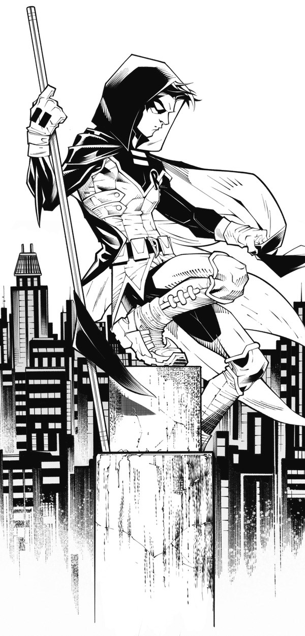
Here is an example of some digital inks by Marc Deering to help illustrate what I'm talking about.

The lines making up the stone are different from the lines making up shadows on the stone. The shadows on cloth are different from the shadows on buildings. Different brushes are being used to make different types of lines. Some of the digital inks on the Elsewhen pages are using the same types of lines to illustrate cloth, metal, shadow, flesh, etc. and that is what I am talking about. It looks like the same brush is being used. The sameness is flattening the image.
|
| Back to Top |
profile
| search
|
| |
Paul Wills
Byrne Robotics Member
Joined: 18 August 2018
Location: United States
Posts: 934
|
| Posted: 27 November 2021 at 5:16pm | IP Logged | 4
|
post reply
|
|
I wanted to try my hand inking Iron Man
|
| Back to Top |
profile
| search
|
| |
Craig Gassen
Byrne Robotics Member
Joined: 14 April 2021
Location: United States
Posts: 46
|
| Posted: 29 November 2021 at 5:47pm | IP Logged | 5
|
post reply
|
|
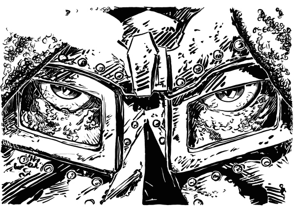
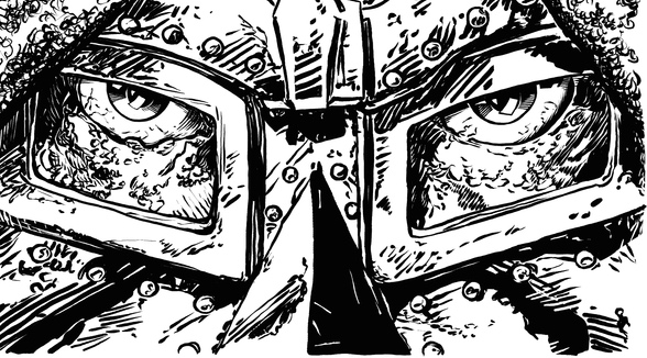
Athanasios, your latest panel and page inks are wonderfully textured and 3-dimensional. After seeing yours, I realized my take on Von Doom’s face was in need of some work, particularly in the pupils which you captured so well. Those tiny curves in the reflected light and value lines in the irises you created were perfect for making them pop. The whole page works so well, especially the grey tone in the machinery. I’m not finished with the page but I’ll post my corrected Von Doom panel. 
|
| Back to Top |
profile
| search
|
| |
Athanasios Kollias
Byrne Robotics Member
Joined: 27 September 2021
Location: Greece
Posts: 339
|
| Posted: 30 November 2021 at 1:41am | IP Logged | 6
|
post reply
|
|
Paul, I love your Iron-Man inks!! The rest of the page is amazing, too. The only thing I would recommend you change would be the chain mail on Cap. It's a tiny portion of the top panel, but it still caught my eye.
Craig, thanks for the kind words. Your inks appear more faithful to the pencils. I am glad you found something in my version to help you. I went for a more or less 80s Austin approach, hence the overuse of lines. Imo, there are 4 distinct areas in this Doom panel, and trying to give them a distinct feel is what makes this work or not: Mask, skin, eyes, hood. I think you did a fine job.
|
| Back to Top |
profile
| search
|
| |
Paul Wills
Byrne Robotics Member
Joined: 18 August 2018
Location: United States
Posts: 934
|
| Posted: 30 November 2021 at 12:28pm | IP Logged | 7
|
post reply
|
|
Thanks Athanasios - Yeah, the chain mail was taking a little bit of liberty to experiment. I've gone back for a redo (and also tweaked some of Iron Man's lines).
|
| Back to Top |
profile
| search
|
| |
Eric Ladd
Byrne Robotics Member
Joined: 16 August 2004
Location: Canada
Posts: 4504
|
| Posted: 01 December 2021 at 2:59pm | IP Logged | 8
|
post reply
|
|
I\m not sure Doom's right eye has that many folds in his tear duct, Craig. You might want to make some decisions about how shadows fall on different surfaces. When you shade metal the same as skin it dulls the image. Try some solid black occasionally. All of your shadows have streaks of light (white) going through them. A good way of creating different looks on different textures is using different shadow patterns. Lastly, you might want to use the white line "halo" effect more sparingly since almost every shadow has a white line around it. Trust the viewer to see where shapes end and begin without the halo.
|
| Back to Top |
profile
| search
|
| |
Craig Gassen
Byrne Robotics Member
Joined: 14 April 2021
Location: United States
Posts: 46
|
| Posted: 07 December 2021 at 4:02pm | IP Logged | 9
|
post reply
|
|
Thanks for the critique Eric. I often debate the white halo line around shapes to give them an extra depth separation, instead I will try trusting the lines to crash into each other going forward. I adjusted Doom’s left eye to clarify shadow vs duct as well.
|
| Back to Top |
profile
| search
|
| |
Craig Gassen
Byrne Robotics Member
Joined: 14 April 2021
Location: United States
Posts: 46
|
| Posted: 07 December 2021 at 11:33pm | IP Logged | 10
|
post reply
|
|
The emotions captured in the faces tell the story so well. Surprise, fear, and concern in so few lines, it really is an education working on these pencil lines. I took the advice from earlier about each panel including fore, middle, and background, specifically in the line weights from her head to arm and hand.
|
| Back to Top |
profile
| search
|
| |
John Byrne
Grumpy Old Guy
Joined: 11 May 2005
Posts: 134817
|
| Posted: 11 December 2021 at 7:33am | IP Logged | 11
|
post reply
|
|
I'm curious what JB used as his primary inking tool. I can't really pin it down looking at his inks. Sometimes it looks like a brush, but at second glance it looks like a pen?••• I’ve used pens, brushes, Q-tips, wadded up kleenex, my thumb—basically anything that will get the ink onto the art with the effects I want.
|
| Back to Top |
profile
| search
|
| |
Paul Wills
Byrne Robotics Member
Joined: 18 August 2018
Location: United States
Posts: 934
|
| Posted: 11 December 2021 at 6:06pm | IP Logged | 12
|
post reply
|
|
That is good to know. I used to think (a while back) that an artist picked a specific inking tool and stuck with it! I feel more liberated knowing I can use a variety of inking instruments.Wait a minute.... your thumb??
|
| Back to Top |
profile
| search
|
| |