| Author |
|
Eric Lund
Byrne Robotics Member
Joined: 15 April 2004
Location: United States
Posts: 2074
|
| Posted: 02 May 2007 at 1:18pm | IP Logged | 1
|
|
|
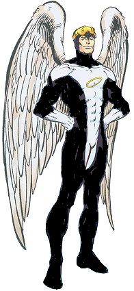
I like the Red Angel costume with the strong spotting of Black in it....I read it as a dark red or Crimson...
But that was my first exposure to the Angel... Hulk Annual 7 by JB... and I always think of the Angel in that costume... What is funny is that as a kid I liked BLUE better and in one panel colored my comic with a blue crayon over the red parts cause I thought it would make the Angel look better and I had accidently switched it to the original Adams version without even knowing....
|
| Back to Top |
profile
| search
|
| |
Michael Connell
Byrne Robotics Member
Joined: 13 January 2006
Posts: 4026
|
| Posted: 02 May 2007 at 1:23pm | IP Logged | 2
|
|
|
What Magneto saw.
I suppose this is what the costume might look like to the other characters not having to deal with printing issues.
|
| Back to Top |
profile
| search
|
| |
Matt Reed
Byrne Robotics Security
Robotmod
Joined: 16 April 2004
Posts: 35734
|
| Posted: 02 May 2007 at 1:23pm | IP Logged | 3
|
|
|
Thom Price wrote:
| For me, it's the amount of blue that is used which determines how my eye views it. If the Angel costume had been 90% black with small blue highlights, then my eye would certainly register it as black. |
|
|
Right. That's why Clark's hair never registered that is was anything other than black to me:
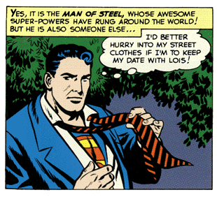
There's more black than blue in the hair depicted here, thus it always read as black to me.
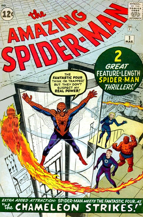
But Spider-Man, save for the AF 15 cover, has more blue than black:
I'm certainly not questioning original intent, just what color my eye "reads" when I look at the pics above.
|
| Back to Top |
profile
| search
|
| |
Ron Farrell
Byrne Robotics Member
Joined: 16 April 2004
Posts: 1518
|
| Posted: 02 May 2007 at 1:26pm | IP Logged | 4
|
|
|
JB: "one of those "colors not found in nature" costumes -- a black that reflects red highlights."
*************************
Maybe not in nature, but stout beer (like Guinness) is black with red highlights.
|
| Back to Top |
profile
| search
|
| |
Michael Kennedy
Byrne Robotics Member
Joined: 17 July 2006
Location: United States
Posts: 242
|
| Posted: 02 May 2007 at 1:27pm | IP Logged | 5
|
|
|
I know what you mean, Mr. Reed. Although, judging by the color of that Amazing Spider-Man cover, he has purple pants (borrowing the Hulk's wardrobe!?) and Mr. Fantastic has a purple uniform!
Heh. Color is fun.
|
| Back to Top |
profile
| search
| www
|
| |
Daniel Cort
Byrne Robotics Member
Joined: 21 March 2007
Posts: 197
|
| Posted: 02 May 2007 at 1:45pm | IP Logged | 6
|
|
|
Greg Kirkman wrote:
| Now, is that what Ditko intended when he designed the suit? Probably not. But that's the way it stands today. |
|
|
He intended it to be blue. Cool blue, specifically.
Steve Ditko wrote:
| My original color combination was a warm red orange
on the webbing section and a cool blue on the body parts. These colors
made a nice contrast, they emphasized the webbing and added to the
mystery mood. S-M's blue was changed to warm purple inside the book (it
gets warmer, redder in later issues, ruining the better contrast and
mood). |
|
|
|
| Back to Top |
profile
| search
|
| |
Michael Everall
Byrne Robotics Member
Joined: 31 March 2007
Location: United States
Posts: 640
|
| Posted: 02 May 2007 at 1:51pm | IP Logged | 7
|
|
|
"Captain Cheerios"...bad, very bad costume.
Funny thing though, in the hands of the wrong artist, even a good costume can look bad. I remember the Silver Centurion Iron Man and really liking it, but other than JB, Mark Bright, and (possibly) Bob Layton...every other artist's version of the armor really sucked for some reason!
|
| Back to Top |
profile
| search
|
| |
Vinny Valenti
Byrne Robotics Member
Joined: 17 April 2004
Location: United States
Posts: 8039
|
| Posted: 02 May 2007 at 1:54pm | IP Logged | 8
|
|
|
I have to admit that I liked when JB drew the New Coke Iron Man armor in the pages of the Hulk. But yeah, i did seem to be bulkier than it needed to be...guess that's why it didn't last long at all!
|
| Back to Top |
profile
| search
|
| |
Greg Kirkman
Byrne Robotics Member
Joined: 12 May 2006
Location: United States
Posts: 15775
|
| Posted: 02 May 2007 at 2:01pm | IP Logged | 9
|
|
|
He intended it to be blue. Cool blue, specifically.
Steve Ditko wrote:
| My original color combination was a warm red orange on the webbing section and a cool blue on the body parts. These colors made a nice contrast, they emphasized the webbing and added to the mystery mood. S-M's blue was changed to warm purple inside the book (it gets warmer, redder in later issues, ruining the better contrast and mood). | | |
+++++++++++++
Didn't know that. Thanks!
|
| Back to Top |
profile
| search
e-mail
|
| |
Daniel Cort
Byrne Robotics Member
Joined: 21 March 2007
Posts: 197
|
| Posted: 02 May 2007 at 2:07pm | IP Logged | 10
|
|
|
I liked the New Coke armor (great name, BTW) too, but it lasted for 32 issues, just under 3 years. Not the classic red & yellow longevity, but Red and Silver appeared in more issues than the original grey armor and the gold armor combined
|
| Back to Top |
profile
| search
|
| |
Eric Lund
Byrne Robotics Member
Joined: 15 April 2004
Location: United States
Posts: 2074
|
| Posted: 02 May 2007 at 2:25pm | IP Logged | 11
|
|
|
I love the classic Red and Gold Iron Man it was so iconic!!!... MUCH better than all the gobbledygook he has now for armor.
|
| Back to Top |
profile
| search
|
| |
John Byrne
Grumpy Old Guy
Joined: 11 May 2005
Posts: 132316
|
| Posted: 02 May 2007 at 2:34pm | IP Logged | 12
|
|
|
Now, is that what Ditko intended when he designed the suit? Probably not. But that's the way it stands today.+++ He intended it to be blue. Cool blue, specifically. *** He intended the hi-lights to be "cool blue". This… 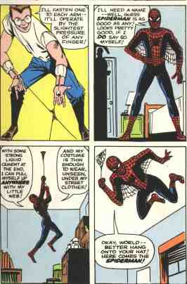
…is clearly not meant to be a "cool blue" and red costume. The blacks dropped out, just as the amount of webbing on the red parts simplified, as deadlines crowded and Ditko started (even unconsciously) cutting corners. This is the same way in which Batman's costume when from black and grey to blue and grey, the X-Men's school uniforms went from black and yellow to blue and yellow, and Wonder Woman's mother's hair turned blonde. (It's also how the Thing ended up with blue eyes, instead of his original brown -- blue for the separator is a single dot of color, brown is two.)
|
| Back to Top |
profile
| search
|
| |